


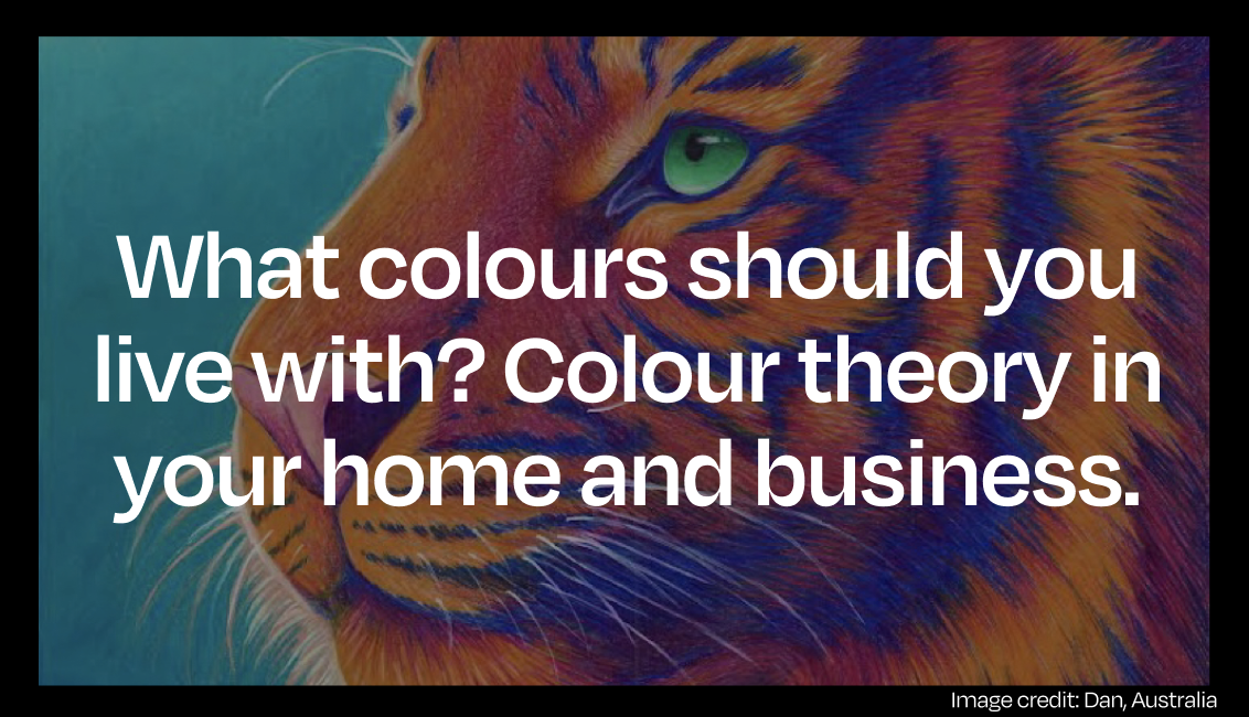
What colours should you live with? Colour theory in your home and business.
Let’s delve into the realm of colour theory. Selecting the right colours for a mural is like choosing the perfect ingredients for a recipe – it’s all about creating the right flavour! Colours set the mood and vibe of a space, making it pop with energy or soothing with calmness. Plus, they tell a story! And let’s not forget the magic of visual interest – mixing and blending colours can create a masterpiece that grabs attention and keeps it! So, whether it’s brightening up a dull corner or adding a splash of creativity to a room, choosing the right colours for a mural is the secret sauce to making art that truly shines!
Warm Reds: Passion and Energy
Ah, red – the fiery hue that’s like a shot of espresso for your space! It’s not just a colour; it’s a burst of passion and energy that gets hearts pumping and conversations flowing. Colour theory suggests that incorporating red into the art around you will ignite your enthusiasm and drive, pumping up your adrenaline and getting your heart racing. It’s the colour of passion and love, but also of power and determination.
Bright Yellows: Optimism and Creativity
Yellow is the burst of sunshine in your space, bringing all the vibes of happiness and creativity. It’s the colour that instantly lifts your spirits and sparks your imagination. With its cheerful disposition, yellow is the perfect pick-me-up for spaces where you want to inspire positivity and innovation. So, whether it’s brightening up your kitchen or adding a splash of creativity to your workspace, incorporating yellow through wall colours, curtains, or funky cushions is sure to set the stage for endless smiles and brilliant ideas!
Calming Greens: Relaxation and Harmony
Green is like a zen master of colour theory, bringing all the chill vibes of nature indoors! It’s the color that whispers tranquility and harmony, creating a sanctuary of calm wherever it goes. Picture your bedroom or meditation space enveloped in the serene embrace of green, like a peaceful forest retreat right in your own home. Whether it’s lush plants, soothing wall paint, or cozy throws and rugs, adding touches of green is like giving your space a big, rejuvenating hug. So, whether you’re craving the deep, mystical vibes of forest green or the soft, soothing tones of sage, embracing green is sure to turn your space into a tranquil oasis where stress melts away and inner peace reigns supreme!
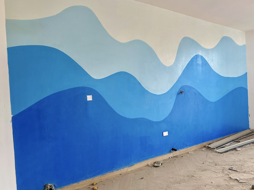
Cool Blues: Tranquility and Peace
Imagine your bedroom or bathroom transformed into a peaceful oasis with the soothing hues of blue, like floating on a cloud or diving into the ocean depths. Whether it’s dreamy pastels for a serene escape or rich, deep blues for a touch of sophistication, blue has got your back for ultimate relaxation. Blue is also associated with increased focus and productivity. Studies have shown that exposure to blue can enhance cognitive performance and concentration, making it an excellent choice for workspaces or study areas. Lighter shades of blue can visually expand a space, creating a sense of openness and airiness.
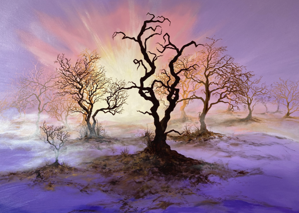
Rich Purples: Luxury and Creativity
Purple has long been associated with spirituality and wisdom. It’s often seen as a color that encourages introspection and deeper understanding of the self and the universe. Surrounding yourself with purple can foster spiritual growth and inner peace. Whether it’s a painting, sculpture, or other artistic creation, purple art can serve as a focal point in your home or workspace, adding beauty, inspiration, and positive energy to your surroundings. Surrounding yourself with this color can help unlock your creative potential and inspire innovative thinking.
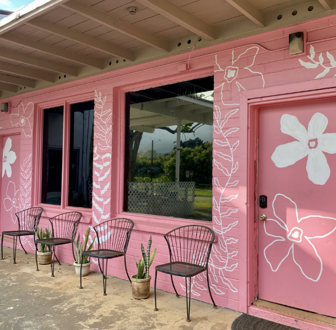
Soft Pinks: Comfort and Warmth
Pink is often associated with feelings of love, compassion, and nurturing. By surrounding yourself with this gentle colour, you can create a space that promotes warmth, kindness, and emotional balance. Commissioning pink art is a fantastic way to infuse your space with these uplifting qualities while also supporting artists and adding a touch of whimsy and charm to your surroundings.
Pink is frequently used to evoke a sense of femininity, playfulness, and innocence. It’s a versatile colour that can range from soft pastel hues to vibrant shades, offering a wide range of possibilities for expression. Pink is often associated with childhood and is commonly used in products and environments intended for children or to evoke a sense of nostalgia.
Energising Oranges: Zest and Enthusiasm
Add a splash of sunshine to your day, infusing your space with all the zest and zing of a tropical paradise! It’s the colour that shouts excitement and radiates positive vibes, turning even the most mundane corners into vibrant playgrounds of creativity. With orange, every moment becomes a celebration, every idea a burst of inspiration! It’s the hue of adventure, the shade of spontaneity, and the pigment of pure joy!
Orange is frequently used to add a bold and dynamic pop of color to interiors, branding, and artwork. It’s a hue that commands attention and creates a sense of excitement and liveliness. In nature, orange is often found in sunsets, autumn foliage, and ripe fruits, evoking feelings of warmth and abundance.
Grounding Browns: Stability and Comfort
Brown may seem like a simple colour, but it’s actually quite complex and rich in symbolism and meaning. As a mixture of red, yellow, and blue, brown embodies a sense of stability, reliability, and earthiness. It’s often associated with the natural world, evoking images of soil, wood, and autumn leaves. In colour theory, brown is often seen as grounding and comforting, creating a sense of warmth and security. It’s a colour that encourages a connection to the earth and a feeling of being rooted in one’s surroundings.
In design, brown is often used to add a sense of warmth and coziness to a space. It can create a rustic or organic feel, particularly when paired with natural materials like wood or stone. Brown can also serve as a neutral backdrop, allowing other colours to pop and stand out against it. In fashion, brown is often seen as a timeless and versatile colour, capable of conveying both elegance and simplicity.
Check out top-rated local artists near you!
Are you an artist ? Sign Up


